Friday, 3 June 2011
Wednesday, 11 May 2011
Saturday, 16 April 2011
Design Preparation
Starting to plan my website and gather the work I want to include on it. I'd like to put up my previous project of snowboard designs but I want to find a better way of displaying them. Whether it be trying to photoshop my designs onto real photographs of boarders or something else!
This is a possible solution...
This is how I've been showing my designs so far, on a simple vector template.
This is a possible solution...
This is how I've been showing my designs so far, on a simple vector template.
This is showing the same designs on a more realistic looking model, it was a free template online, so I might make a few changes to highlights and shadows just to make it bit more mine.
Better than the above anyway.
Friday, 15 April 2011
Full Portfolio
Need to change one or two little bits, and get rid of the lorum Ipsom, but other than it's good to go.
After FMP work will likely change, probably keep half of this stuff though.
Wednesday, 13 April 2011
Headed Paper
Quick turnaround for this. Keeping in line with my business card.
Information, contact details, E-mail etc all on right hand side. All taken from business car, Neuzeit Book and Book Heavy.
Uniform position for date, Courier New Bold, then copy text to be in Courier New Reg.
Information, contact details, E-mail etc all on right hand side. All taken from business car, Neuzeit Book and Book Heavy.
Uniform position for date, Courier New Bold, then copy text to be in Courier New Reg.
Updated Business Cards
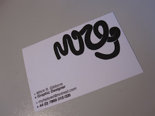
With the destruction then kidnapping of my Laptop I managed to lose more work. The latest victim being my logo and business cards. So recreated them, changed them ever so slightly....
So the details on the card have changed, putting my professional E-mail on, which at the moment isn't up and running but will be within the next week when I get my website up and running. Got Mitchgibbons.com so s'all good.
Different typeface, Neuzeit STD. No Italics, and got rid of +, making it less busy, clear. Defining the two sections with use of '_'.
The back designs.... I've put up more than one image because I want to have a different designon each card, or at least have some different than others. I intend to print them from Moo.com which allow you to put up to 10 different images for one print job, so I will be using these four atleast...
Monday, 14 February 2011
Friday, 11 February 2011
Thursday, 10 February 2011
D&AD
Had a quality discussion with Jake from JP74, proper nice guy and I got some useful feedback! He liked my work which is always a pleaser and has given me some food for thought on certain areas of my portfolio.
. Structure
Flicking through the old portfolio which contains all the work I want included in the portfolio he said to switch around some of the pages, notably having some of my strong type work to be at the front, so to show my type skills as a designer then have the wayward work of my snowboards and stuff like that!
. Speaking
Got given some words of advice on how I should be talking about my work, showing passion and being excited about it, as I seemed a bit lax, bit too 'chilled' like. Not over the top though, If im excited about my work so will the person I'm talking to. This also being important if I decide not to include many descriptions or copy within it. This way I need to be able to open it and 'tell the story', to quote Jake.
. Type
Considering the talking aspect of it type isn;t too much of an issue. There were certain areas of my work that could benefit from having more than just a label as I have at the moment.
Specifically referring to the snowboards, after telling him the background to the brief he advised to include something more, whether it be the riders name to each board, showing that they are all specific to one person. There are other possibilities with this, whether I include the interview / last words question etc
. Snowboard Context
I bought up the issue with the contextualisation of my snowboard designs, his advice was to take a photo of a boarder holding his weapon head on, keeping it straight and therefore easier to mock up on photoshop, i think I'm just about good enough on photoshop to make it convincing. Furthermore sticking the labels on a board.
. Added work
Told me to include the cereal box, specifically the image of it in tescos, that on a double page spread with a small description would work wonders, apparently.
. Twitter
Jake advised me to join Twitter, as it gives a good chance to network with a whole range of designers and creatives, even speaking to the big boys, Erik Spiekerman etc.
. Photography
I raised it as an issue, and Jake agreed, I need to sort the photography out! Which is working in the new one, picturing everything in a suitable context.
All in all really positive.
. Structure
Flicking through the old portfolio which contains all the work I want included in the portfolio he said to switch around some of the pages, notably having some of my strong type work to be at the front, so to show my type skills as a designer then have the wayward work of my snowboards and stuff like that!
. Speaking
Got given some words of advice on how I should be talking about my work, showing passion and being excited about it, as I seemed a bit lax, bit too 'chilled' like. Not over the top though, If im excited about my work so will the person I'm talking to. This also being important if I decide not to include many descriptions or copy within it. This way I need to be able to open it and 'tell the story', to quote Jake.
. Type
Considering the talking aspect of it type isn;t too much of an issue. There were certain areas of my work that could benefit from having more than just a label as I have at the moment.
Specifically referring to the snowboards, after telling him the background to the brief he advised to include something more, whether it be the riders name to each board, showing that they are all specific to one person. There are other possibilities with this, whether I include the interview / last words question etc
. Snowboard Context
I bought up the issue with the contextualisation of my snowboard designs, his advice was to take a photo of a boarder holding his weapon head on, keeping it straight and therefore easier to mock up on photoshop, i think I'm just about good enough on photoshop to make it convincing. Furthermore sticking the labels on a board.
. Added work
Told me to include the cereal box, specifically the image of it in tescos, that on a double page spread with a small description would work wonders, apparently.
Jake advised me to join Twitter, as it gives a good chance to network with a whole range of designers and creatives, even speaking to the big boys, Erik Spiekerman etc.
. Photography
I raised it as an issue, and Jake agreed, I need to sort the photography out! Which is working in the new one, picturing everything in a suitable context.
All in all really positive.
Wednesday, 9 February 2011
Contextualisation
Stationary Set.
The photos of some of my work in my present portfolio are shit! And one of the main problems being that they aren't in context. For the stationary set I thought the best kind of real life situation would be a desk, or something involving, table tops pens, computer screens, pencils etc!


Including the headphones because of the subject being a record label, in the office, on the mac, headphones, stationary set.
Contextualisation
Stickers
Although not my desired place of context for these stickers, it is a definite improvement from just having them on a table or piece of paper, I am infact going to xscape, the indoor slope this evening and I shall be taking photos of my stickers in a more real, desired context there. Showing them across a range of things, such as boards / skis / ramps / rails / boxes / surrounding areas etc!


Friday, 28 January 2011
Personal Promotion
As I build a list of studios and designers that I intend to contact I've been thinking of ways to show them my work in a less formal way of sending them a PDF file of a nicely layed out, clean portfolio. One of these ideas I kind of got from the images below, specifically the latter design.
Having a poster with a wallpaper style image of my own design work. This way I can embed a JPEG into the e-mail so all they get is the image.


So I need to go and organise what work I can actually put in it, bearing in mind Im going to have to take it all from my blog posts as my work is still lost.
Promo Portfolio
Idea for a business card / portfolio. Business size card, two pieces which when pulled apart folds out to a large poster.
Example below...


Think that this could be an interesting piece of design to have to promote myself, a fancy business card say or something to mail out to design studios, get my name out there and all that.
Subscribe to:
Comments (Atom)


